
Choosing the Best Interior Colours for Your Home
Choosing the right colors for your home can set the tone for the entire space. Whether you’re looking to create a calming retreat, a vibrant gathering space, or a neutral base for your decor, the right color palette can bring your vision to life. But with so many options out there, how do you know where to start? Don’t worry—we’ve got you covered. That’s why at LC Painters, we’re known as one of the best interior painters in Burlington and this guide breaks down the process of selecting the best interior colors for your home.
1. Consider the Mood You Want to Create
Colors evoke emotions, so the first step is deciding what kind of mood you want each room to have. Are you aiming for a peaceful, relaxing retreat? Or do you want something more energetic and vibrant? Here’s how colors can affect mood:
• Soft neutrals (whites, grays, beiges): Calm, clean, and timeless.
• Blues and greens: Calming, soothing, and ideal for bedrooms or bathrooms.
• Yellows and oranges: Warm, cheerful, and energizing.
• Reds and deep colors: Bold, dramatic, and stimulating (great for dining rooms or accent walls).
• Earth tones (browns, terracotta, taupes): Cozy, grounded, and inviting.
Tip: Think about how you want to feel in each room—this will guide you toward the right color choices.
2. Take Your Home’s Architecture Into Account
Your home’s architecture and style can influence which colors work best. For example:
• Traditional homes: Rich, classic tones like deep blues, greens, or soft creams tend to complement traditional styles.
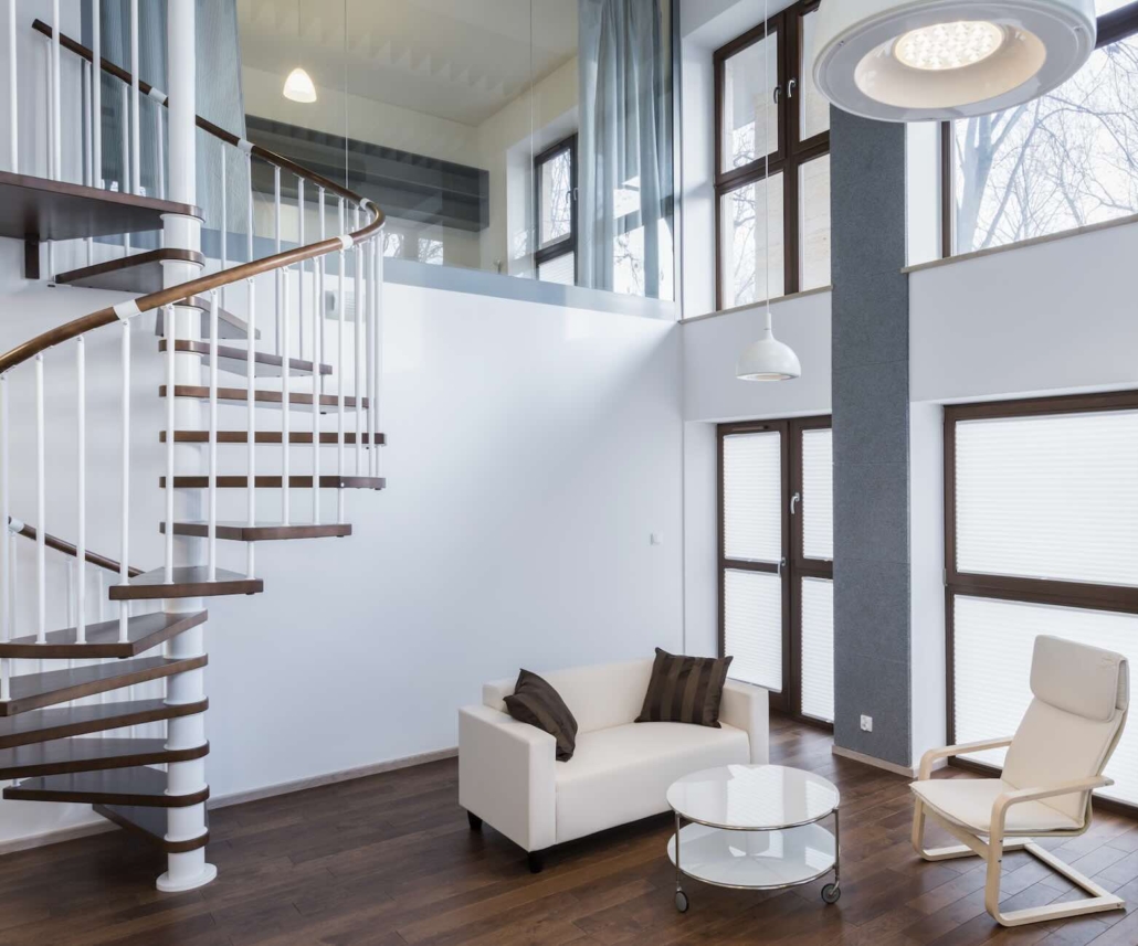
• Modern homes: Clean lines, minimalistic designs, and a neutral palette (grays, whites, black, and metallics) often work well.
• Farmhouse or rustic styles: Warm, earthy tones (like warm beiges, soft greens, and natural wood shades) fit beautifully with rustic and country designs.
Tip: Match your colors to the style of your home, whether it’s modern, traditional, coastal, or industrial, to create a harmonious flow.
3. Start with a Neutral Base
Neutral colors provide a great foundation for any room and make it easier to incorporate other colors later. These shades tend to be more versatile and timeless, allowing your furniture and decor to stand out.
• Popular neutrals include shades like white, beige, gray, taupe, and ivory.
• Neutrals create a calming backdrop and are easy to switch up if you want to update your decor in the future.
Tip: Start with neutral walls, and then add color through accessories, textiles, and accent walls. This gives you flexibility while still having a cohesive look.
4. Choose a Color Palette for Each Room
Once you’ve picked your mood and base colors, it’s time to select a specific color palette for each room. Think about how each space will be used and the lighting that it receives:
• Living Room/Family Room: If you want the space to feel cozy and inviting, opt for warm tones like beige, soft brown, or muted green. For a more vibrant, lively atmosphere, try a deeper blue or orange accent wall.
• Bedroom: Calming shades like light blues, greens, soft lavender, or even light grays help create a peaceful atmosphere for rest and relaxation.
• Kitchen: Lighter colors like whites, pale blues, or soft grays are great for kitchens because they reflect light and make the space feel brighter and more open. A pop of color (like mint green or mustard yellow) can add personality.
• Dining Room: Rich colors like deep reds, burgundy, navy blue, or a muted gold can create an intimate, elegant atmosphere perfect for entertaining.
Tip: Consider the purpose of each room when choosing a color. Warm tones are often great for social areas, while cooler, muted tones work well in spaces meant for rest or concentration.
5. Test Paint Samples in Your Space
Before committing to a color, test out paint samples on your walls. Paint large swatches and observe how they look at different times of day, with natural light and artificial lighting.
• Paint a large square (around 2×2 feet) to get a better sense of how the color will look on your walls.
• Test multiple shades of the same color to find the perfect one. Sometimes a slight variation can make a huge difference.
Tip: Colors can look different depending on the light in the room. What looks great in the store might look completely different on your wall.
6. Consider the Flow Between Rooms
If you’re painting multiple rooms in your home, it’s important to think about how colors will flow from one space to another. You want to maintain a cohesive, harmonious look throughout your home.
• Opt for colors that complement one another or use different shades of the same hue to create a fluid transition.
• Open-plan layouts often benefit from neutral or soft tones that connect different areas visually, while you can reserve bold colors for accent walls or specific rooms.
Tip: Consider using one accent color throughout the house for consistency, but change up the tones or intensity in different rooms to suit the function of each space.
7. Account for Your Furniture and Decor
Make sure the colors you choose work well with your existing furniture and decor. You don’t want the wall color to clash with your couch, curtains, or art.
• If you have bold or colorful furniture, opt for neutral or subdued wall colors to balance the space.
• If your furniture is neutral, you can afford to experiment with bolder wall colors or accent walls to add interest.
Tip: Keep the tones in mind—if your furniture is warm-toned, go for warm wall colors, and if it’s cooler, lean toward cool-toned paint.
8. Factor in Lighting
Lighting plays a huge role in how your colors will look in your space. Different light sources (natural, warm, cool) can affect how a color appears on your walls.
• Natural light: Colors will look lighter and truer to their shade.
• Incandescent light: This will make warm colors feel more cozy but can make cool colors look dull.
• Fluorescent light: Can create a cold and harsh feel, especially with warmer tones.
Tip: When testing paint samples, view them in the room at different times of the day to see how the light affects them.
9. Don’t Be Afraid to Experiment with Accent Walls
If you’re hesitant about committing to a bold color for an entire room, accent walls are a great compromise. An accent wall can add depth, visual interest, and personality without overwhelming the space.
• Consider painting one wall a contrasting color to highlight a specific area (such as behind a bed, a fireplace, or a piece of artwork).
• You can also use wallpaper, stencils, or different textures to create unique focal points.
Tip: Keep the accent wall in line with your overall color palette, but use a deeper or brighter shade to make it pop.
10. Stay True to Your Personal Style
Ultimately, the colors you choose should reflect your personal style and taste. Don’t feel pressured to follow trends if they don’t resonate with you. Your home should feel like an extension of yourself.
• If you love vibrant colors, go for it—bright yellows, blues, or greens can make your home feel alive.
• If you prefer more neutral tones, focus on textures, patterns, and subtle tones to create a sophisticated and timeless atmosphere.
Tip: Trust your instincts! If a color makes you feel good, it’s likely the right choice for your space.
Conclusion:
Choosing the best interior colors for your home is a personal and exciting process. With careful consideration of your home’s style, the mood you want to create, and your personal preferences, you can create a space that feels both beautiful and functional. Whether you go for soft neutrals, bold accents, or calming blues, the key is to make choices that enhance your lifestyle and reflect your personality. And when it’s time to bring those choices to life, working with the best interior painters in Burlington can make all the difference.


Leave a Reply
Want to join the discussion?Feel free to contribute!